
|
|
#1
 12-03-2015, 03:21 AM
|
|||
|
|||
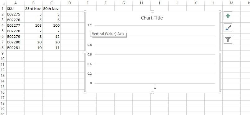 Hi, Please see the above image showing a table detailing sales for each SKU over a weekly period. I wish to plot the SKU coloumn on the left Y Axis. I would like the dates to go along the horizontal axis and values to be on the right Y axis. The idea behind this is that we will be able to see any significant increases or decreases for each SKU week after week. I have done some searching but am unable to get this the way I want it. Is it possible? 
|
|
#2
12-07-2015, 01:57 PM
|
|||
|
|||
|
Quote:
|

|
| Tags |
| graphs, line, time |
|
|
 Similar Threads
|
||||
| Thread | Thread Starter | Forum | Replies | Last Post |
| How to use Resource Graph to show task percentge | mr_stone | Project | 3 | 12-02-2015 08:54 AM |
 Graph occurences over full range of time? Graph occurences over full range of time?
|
pixeldroid | Excel | 1 | 07-13-2015 09:30 AM |
|
column clustered bar graph with a line graph as secondary axis
|
Alaska1 | Excel | 2 | 06-09-2014 07:13 PM |
| Priority of line graph vs bar graph in terms of front to back positioning on a chart | DavePPointuser | PowerPoint | 1 | 04-30-2014 10:57 AM |
|
Report to Show Individual Assignments
|
mikelanne | Project | 1 | 12-04-2011 11:51 AM |


 Linear Mode
