
|
|
#1
 03-21-2015, 11:42 AM
|
|||
|
|||
|
Hello everyone,
I am trying to create a graph in Excel similar to this: DSC_0029.jpg I have read multiple threads online and watched many videos but none of them turn out the way I want them to after following the precise instructions. Could someone please explain to me how to do this? I am using Microsoft Office 2013. Many thanks Alex 
|
|
#2
03-23-2015, 06:27 AM
|
|||
|
|||
|
You can create this using a second axis. Here is a page that might help.
http://blogs.office.com/2012/06/21/c...a-second-axis/
|
|
#3
03-23-2015, 12:21 PM
|
|||
|
|||
|
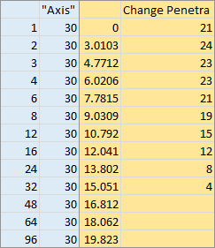
Set up the data as follows. The first column contains the X values from the top axis, and the second column contains the value 30, which is the maximum of the Y axis. The third column converts the first column into the scale from the bottom axis, and the fourth column contains the Y values of the data. Leave the top cell of the first and third columns blank.
 Select the third and fourth columns of data (shaded gold), and insert an XY Scatter chart, Chart 1 below. Copy the first two columns (shaded blue), select the chart, and use Paste Special to paste the data as new series, categories in first column, series names in first row, Chart 2. Format the newly added series, so that it is plotted on the secondary axis, Chart 3. Excel has added the secondary vertical but not horizontal axis. Remove the secondary vertical axis and add the secondary horizontal axis, Chart 4. Format all of the axes, Chart 5. Primary Horizontal Axis (bottom): min = 0, max = 20. Primary Vertical Axis (left): min = 0, max = 30. Secondary Horizontal Axis (top): logarithmic scale, min = 1, max = 100. Delete the legend. Add axis titles to each axis, Chart 6. 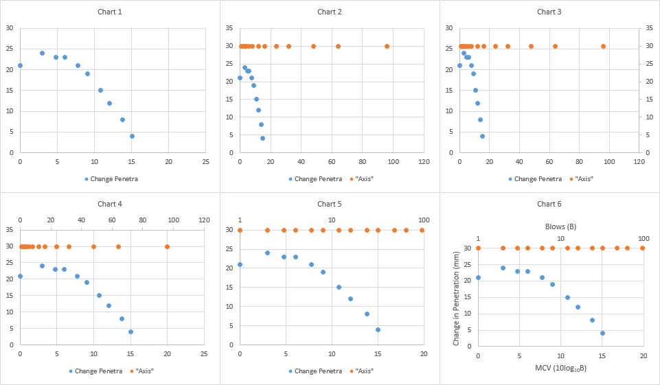 Hide the numerical axis labels on the top axis by changing the tick label number format to " " (two spaces surrounded by double quotes), Chart 7. This maintains the spacing we will need for the labels we will add in a moment. Add data labels to the "Axis" series located along the top edge of the chart, Chart 8. Position them above the points. I've colored them to match their parent data series, to remind us where they came from. Format these data labels so they are displaying the X values instead of the default Y values, Chart 9. Select the "Axis" series and add error bars. Excel adds horizontal and vertical error bars, some of which are too short to see, Chart 10. Select the horizontal error bars, if necessary using the Current Selection dropdown in the top left of the Chart Tools > Format ribbon tab, and click Delete, Chart 11. Format the vertical error bars as follows: Minus direction, no end caps, and value 100 percent. I've colored them to match their parent data series. Add a trendline to the original data series, Chart 12. 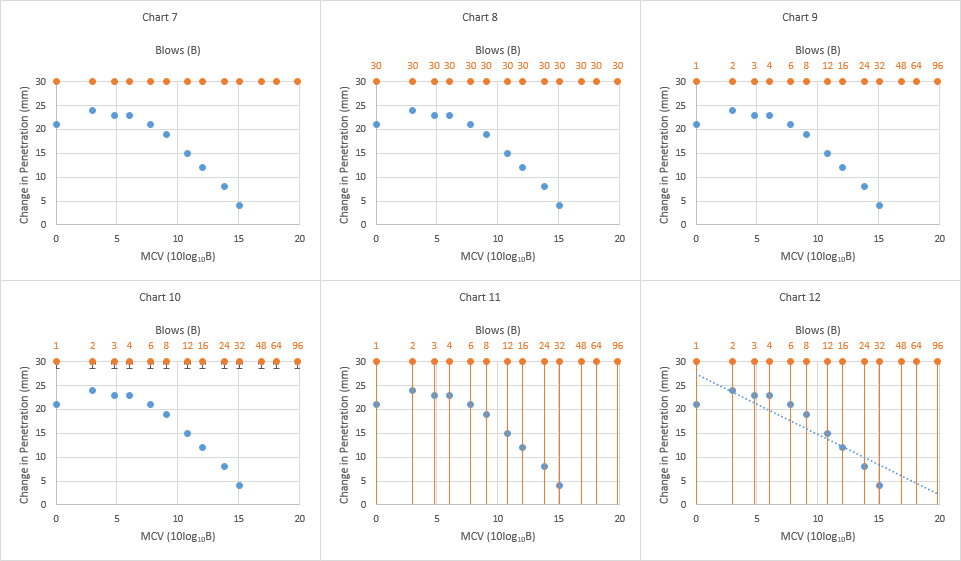 Format the trendline to use a solid line, and use the polynomial fit option, with order 2, Chart 13. Finally clean everything up, Chart 14. All text the same dark gray. Delete vertical gridlines, format vertical error bars, horizontal gridlines, plot area, and axes with the same medium gray. 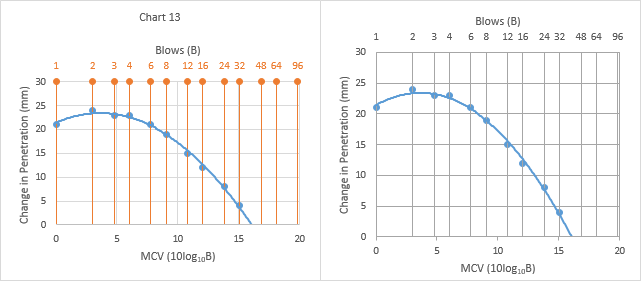
|

|
| Tags |
| 2013, graphs, plot |
| Thread Tools | |
| Display Modes | |
|
|
 Similar Threads
|
||||
| Thread | Thread Starter | Forum | Replies | Last Post |
 column clustered bar graph with a line graph as secondary axis column clustered bar graph with a line graph as secondary axis
|
Alaska1 | Excel | 2 | 06-09-2014 07:13 PM |
|
how to create menu shortcut to insert specific picture
|
msworddave | Word | 1 | 05-08-2013 02:00 AM |
|
how to display Timestamp on x-axis in Scatter smooth line graph
|
bugserm | Excel | 1 | 01-23-2012 02:28 AM |
| Triple Axis Line Graph | sschultz0956 | Excel | 1 | 09-28-2010 12:39 PM |
| how do I add data values in Col A into X axis on bar graph? | hazz | Excel | 1 | 04-27-2010 01:42 PM |


 Linear Mode
