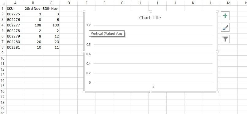
Hi, Please see the above image showing a table detailing sales for each SKU over a weekly period. I wish to plot the SKU coloumn on the left Y Axis. I would like the dates to go along the horizontal axis and values to be on the right Y axis. The idea behind this is that we will be able to see any significant increases or decreases for each SKU week after week.
I have done some searching but am unable to get this the way I want it. Is it possible?